
If you’ve ever opened a website on your phone and found yourself pinching, zooming, and endlessly scrolling just to read a paragraph—then you’ve experienced a website not built for mobile users.
In a world where over 60% of web traffic comes from smartphones, having a mobile-friendly website isn’t optional—it’s essential. Whether you’re a local business in Prescott, AZ, or an eCommerce brand reaching national markets, optimizing your site for mobile users is critical to online success.
In this article, we’ll explore what makes a site mobile-friendly, why it matters, and how Prescott’s own Quad Cities Design can help you build a seamless, high-converting mobile experience.
What is a Mobile-Friendly Website?
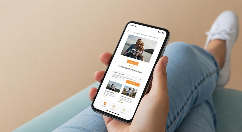
A mobile-friendly website is a site designed to look and function well on smaller screens—smartphones, tablets, and other mobile devices. It ensures that visitors can navigate, read, and interact with your content easily, regardless of screen size or device type.
A truly mobile-optimized site adapts its layout, text, images, and features to create a fluid, user-first experience. This is typically achieved through responsive web design, a practice that allows your site to resize and restructure itself based on the device it’s viewed on.
Why Mobile-Friendliness Matters for Your Business
Mobile-friendliness isn’t just a tech trend—it directly impacts your customers, conversions, and online visibility. Here’s why:
Improved User Experience
Visitors expect seamless browsing, and if your site isn’t easy to navigate or read on mobile, they’ll leave. A responsive, fast-loading mobile site delivers a superior experience that keeps users engaged—and more likely to take action.
Higher Google Rankings
Google uses mobile-first indexing, meaning it prioritizes the mobile version of your website for rankings. If your site isn’t mobile-friendly, you risk dropping in search results—especially for competitive local keywords.
Faster Page Load Speed
Speed matters. Studies show that 53% of users abandon sites that take more than 3 seconds to load. Mobile site speed optimization reduces bounce rates and improves your chances of converting visitors into leads or customers.
Better Conversion Rates
A mobile-optimized site removes barriers to action—making it easier for visitors to call, contact, or buy from you. That’s why businesses with strong mobile experiences often see higher conversion rates across the board.
Increased Local Search Visibility
Google Maps and “near me” searches dominate mobile behavior. Having a local business mobile website ensures your site ranks higher in local SEO and helps drive mobile commerce growth in your area.
The Impact of Mobile-Friendly Websites on SEO
A mobile-friendly website plays a huge role in your overall SEO strategy. Search engines like Google now assess your site’s mobile usability as a core ranking factor. This includes:
- Mobile page speed
- Tap target size
- Readability without zooming
- Responsive design quality
- Bounce rate from mobile users
These mobile SEO ranking factors determine how visible your site is to people searching on phones or tablets. A poorly optimized mobile site could mean losing out on valuable organic traffic.
Want to improve your site’s visibility? Quad Cities Design builds fully optimized mobile-first websites with SEO baked into every line of code.
5 Key Features of a Mobile-Friendly Website
You don’t need to guess whether your website is mobile-ready. Here are the top elements every mobile-optimized site should include:
- Responsive Design
Your website should automatically adjust its layout to fit any screen size. This ensures that users on smartphones and tablets enjoy a seamless, frustration-free experience. - Fast Loading Speed
Use compressed images, optimized code, and efficient hosting to reduce load times. Mobile users expect near-instant access—and Google expects you to deliver. - Easy Navigation
Menus, buttons, and links should be easy to tap with fingers, not a mouse. Simplify your navigation and make sure essential pages (contact, services, about) are easily accessible. - Readable Text & Content
No one wants to zoom in just to read a paragraph. Use legible fonts, appropriate spacing, and clear formatting so that content is easy to consume on smaller screens. - Click-to-Call & Mobile Contact Forms
Make it simple for users to take action with click-to-call buttons and forms designed for mobile. This boosts leads and streamlines the customer journey.
Why You Should Hire a Professional to Optimize Your Website for Mobile
Sure, DIY website builders exist—but when it comes to mobile optimization for SEO and user experience, nothing beats professional design. Here’s why hiring experts like Quad Cities Design is worth it:
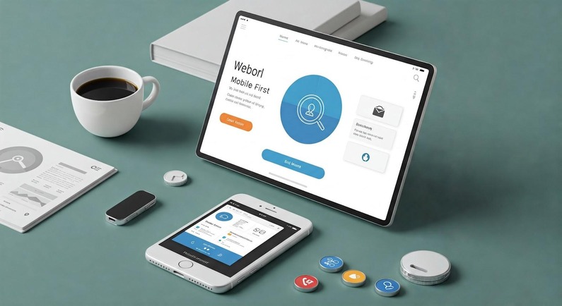
Expertise in Responsive Web Design
We specialize in mobile-first website design, meaning your site is built from the ground up with mobile users in mind. It’s not an afterthought—it’s the foundation.
Better SEO Implementation
Professional developers know how to incorporate structured data, image optimization, and mobile-friendly coding that search engines love—boosting your rankings in the process.
Custom Design for Your Business Needs
Your business is unique. A custom mobile design ensures that your branding, messaging, and customer journey align with your specific goals—not some generic template.
Technical Support & Maintenance
Mobile tech evolves fast. Partnering with Quad Cities Design means you’ll have ongoing support and updates to keep your site compliant, secure, and high-performing.
Cost & Time Efficiency
Building a mobile-friendly site from scratch takes time, trial, and error. We streamline the process, saving you hours of work and avoiding costly mistakes.
Need proof? See how our Prescott web design services help local businesses attract more customers and grow online.
How to Test If Your Website Is Mobile-Friendly
Not sure if your site is mobile-ready? Here are a few simple ways to check:
- Use Google’s Mobile-Friendly Test:
Visit Google’s Mobile-Friendly Tool and enter your URL. It’ll show you any major issues.
- Manually Test on Multiple Devices:
View your website on a smartphone and tablet. Check navigation, content readability, and loading speed.
- Inspect with Chrome Developer Tools:
Use Chrome’s built-in tools (right-click > Inspect > toggle device toolbar) to simulate your site across different screen sizes.
- Check Page Speed with Google PageSpeed Insights:
This tool highlights mobile-specific speed issues and offers recommendations.
- Test Tap Targets:
Try clicking on buttons and links—are they easy to tap, or are they too small/close together?
If your site fails any of these tests, it’s time to invest in a better experience for your visitors—and your business.
Let’s Make Your Website Work for Every Screen
In 2025, it’s not just a “nice to have”—a mobile-friendly website is a business essential. From improving user experience to climbing Google rankings, the benefits are too significant to ignore.
Whether you’re starting fresh or upgrading an outdated site, Quad Cities Design in Prescott, AZ, is your go-to partner for responsive web design. We understand what local businesses need to thrive in a mobile-first world—and we deliver tailored, SEO-driven solutions that perform on every device.
Ready to take your website mobile?
Visit Quad Cities Design or contact us today for a consultation and let’s build something better—together.